Tuesday, April 23, 2013

A New Spin on the Ice Cream sandwich

Over time, the Strand has been wheelin’ in the years and just begging for a tasty alternative to the typical beach front eats. Having recently rolled into town is The Manhattan Beach Creamery ‘wich provides 28 different a-la carte ice cream flavors available daily (and more seasonally). This is not your grandmother’s vanilla candy store; in addition to ice cream, they make custom cupcakes, sell candy and their specialty, the cream’wich!


This is what their website says about their cream’wich:
"The cream’wich begins with a signature cookie. This is what sets the cream’wich apart from the rest. Our chocolate chip cookies are fresh-baked daily, using a family recipe passed down from generation to generation. All ice cream is artisan made from scratch in small batches using only the best quality ingredients. Every cream’wich is hand crafted at the Manhattan Beach Creamery with careful attention to each detail. Chill out and enjoy local!"


We were tasked with decorating these sweet stainless steel insulated cream’wich carts. The brand new carts (furnished by the customer) rolled into our shop, and required some dis-assembly spin before we could apply the graphics. Wheels had to be removed along with some additional hardware. Since durability was a concern, we recommended applying the graphics on a panel-by-panel basis which drastically increased the fun. This would give the customer the flexibility to replace a single graphics panel if it was damaged during usage.


We used 3M Controltac with the matching 3M over-lam film, thus protecting this gastronomical signage endeavor. This is the same high quality material we use for car graphics, just more tasty. Once the graphics were applied, the carts were re-assembled.

The client’s design allows space for safely applying a repositionable graphic on top of the Controltac for seasonal, flavor or special offers. The repositionable label is a great solution for adding marketing flexibility to the cart design.


This was a “tasty” project on ‘wich to work and the end result is nothing but charming!
If you have a project in which 3V Signs and Graphics can help you sweeten your branding and advertising goals, please let me know. You’ll receive the same level of sugary delicious service Manhattan Beach Creamery received!

http://mbcreamery.com/Home.html
Friday, April 5, 2013

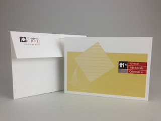
I just finished this short run invitation and envelope for Project GRAD LA’s annual
scholarship celebration event. This is a consistently attended intimate event taking
place at the Academy of Television Arts and Sciences Theater. Although smaller and
less complex of a project than I normally discuss, I really enjoy working with
the organization and their designer, Durre Design. I especially like the
organization’s goals, which are outlined below.


It’s a short run of 400 invites and 400 envelopes. The invite was engineered to print
work and tumble (one set of plates to save costs) using 3 PMS colors on both sides
on 100# Classic Crest Cover paper. The different values of the PMS colors make for
an easy-to-read yet eye catching spread interwoven with the faces of several
Project GRAD students. The invite was printed on a 5/c 14x20 press particularly suited
for such a short run. After printing, a gloss foil stamp in the shape of a graduation
cap was applied to the face and a final die score was added to insure a clean fold.


The envelope is an 80# Classic Crest pre-formed A7 envelope printed in 2 PMS colors.
Although only two colors were used, the various screen value mixes provides an
appearance of more than just 2 colors. The end result is a very handsome
outgoing envelope. The RSVP function is traditional (phone or email).


Project GRAD Los Angeles focuses on helping the children of the low-income,
Northeast San Fernando Valley prepare for college success.

You can read about Project GRAD Los Angeles' local efforts here: www.projectgradla.org
You can reach Durre Design here: http://durredesign.com